Insights from one year of flow-based market coupling in the Nordics

Did you know that the transformer at Aurland1 is responsible for €6 out of €39/MWh price difference between NO1 and NO3 from the go-live of flow-based market coupling? Or that the main price difference between SE1 and Finland, can almost entirely be ascribed to the grid elements on the Swedish-Finnish border?

Author

Gro Klæboe

Published

Oct 31, 2025

Power grid during summer

This week we celebrate the one-year anniversary of flow-based market coupling in the Nordics, and the examples above illustrate what kind of calculations are available to us now. The change in market clearing methodology has given us a richer and more explicit insight into the grid restrictions of the Nordic system, but also made the analysis more complex and challenging for many market players. Let us have a quick look back at the past year.

From Available Transfer Capacity [ATC] to grid-element restrictions

One of the biggest transitions from the ATC-world to flow-based market coupling, is to stop thinking of the power market from zone border to zone border, and start thinking about how an increase in production is distributed in a meshed grid, and how different flow impact on key network elements can explain price differences between zones. Many seasoned power market analysts have had to unlearn old instincts, and suppress the urge to look at flows and remaining capacities on the bidding zone borders.

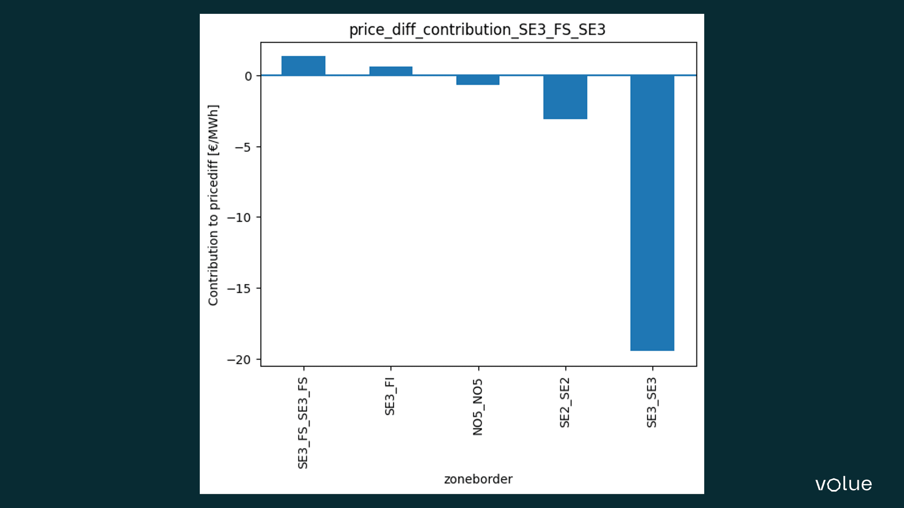
The beauty of the flow-based methodology is that the restrictions on the critical network elements (CNECs) are made explicit and transparent. In the ATC world, the TSOs presented capacities on the bidding zone borders, but the calculations behind these capacities were never revealed. In flow-based market coupling, the impact of each grid element is explicitly stated, and it enables us to calculate the impact of each grid restriction on any zonal price difference, as illustrated in the ingress. However, the price we have to pay is to move from a simple two-dimensional analysis to a 33-dimensional analysis in order to explain bidding zone price differences.

Another topic of unlearning in flow-based market coupling is the interpretation of commercial flows. In the ATC world, the flows on borders were key decision variables that determined whether there would be a price difference between zones or not. In the flow-based market coupling regime, commercial flow between zones is not a key decision variable and cannot be used to interpret price differences between areas. To understand price differences between zones, we must study differences in the power transfer distribution factors (PTDFs), which describe how increased production in one area will distribute across the meshed grid.

Have flows increased?

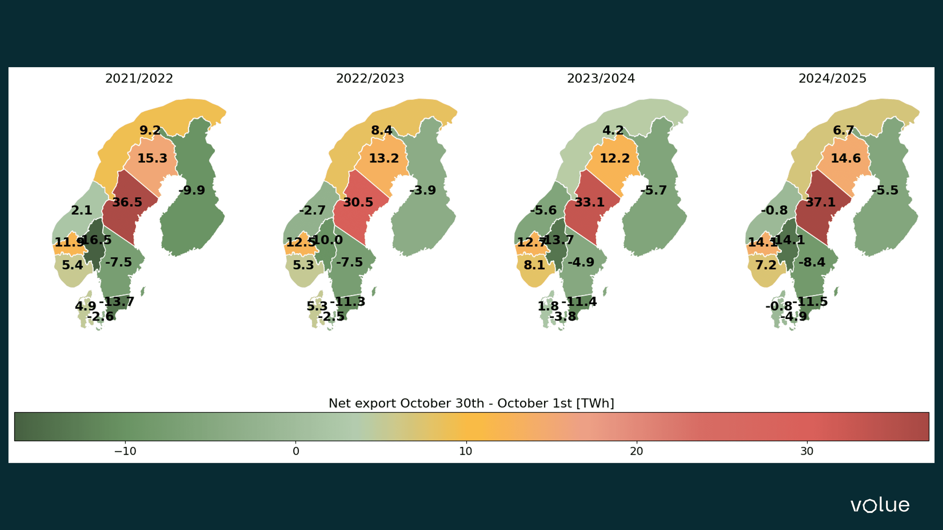
Part of the motivation to introduce flow-based market coupling was to exploit the existing grid capacity better, and to expose the transmission capacity more accurately to the day-ahead market. Therefore, larger flows from areas of surplus to areas of scarcity – such as larger flows North-South in Norway and Sweden, or East-West flows from Sweden to Southern Norway and Denmark in times of Swedish or Finnish production surplus – can be viewed as measures of success. However, since hydrology, consumption, wind production and fuel prices are constantly shifting, it is difficult to compare “apples to apples” when we try to compare post-go-live-flows to historical flows.

Starting by comparing net positions per bidding zone, it is clear that the total export from the four northernmost bidding zones in Norway and Sweden has been strong since the go-live. However, the sum of the net export for these areas was stronger in the year 2021/2022 than in 2024/2025, despite the fact that both years are characterised by large hydrological surpluses in the North, and a deficit in the South.

Figure 1: Sum of net positions per bidding zone pre and post go-live of flow-based market coupling. TWh.

Figure 1: Sum of net positions per bidding zone pre and post go-live of flow-based market coupling. TWh.

Comparing the flows over specific borders pre and post go-live of flow-based market coupling is tricky, since in the ATC world the border flows were determined explicitly in the day-ahead market clearing, but the actual flows could deviate quite a bit from the market coupling flows. In flow-based market coupling, commercial border flows make less sense since this no longer is a key decision variable. Instead, we choose to look at the so-called flow-based flows (1) - the estimated border flows derived from the PTDFs given that the forecast from the TSOs and the generation shift keys are accurate. However, if we look at average border flow per quarter, there are some borders that stand out when comparing to the previous five years:

  • The average flow from SE1-SE2 has increased in all 4 quarters.
  • The average flow from SE2-SE3 has increased in all 4 quarters.
  • The average flow from SE3 and eastwards, both to NO1 and DK1 has increased in all 4 quarters.
  • The average southward flow from NO3 to NO5 has increased in the three first quarters, and Q3 2025 was characterised by grid limitations due to the work on the new NO3-NO5 grid connection Aurland-Sogndal. Exports from NO3 to NO1 have also been strong. 

(1) “Flow-based flow” is JAO terminology. If you look at Nord Pools home pages, these flows are called “Scheduled physical flows”. In Insight by Volue the flow-based flow can be found in the curves named exc {area1}>{area2} ptdf nordic jao mw cet min15 a.

Figure 2: Average day-ahead-market flow in MWh/h between bidding zone SE2 and its neighbours per quarter

Figure 2: Average day-ahead-market flow in MWh/h between bidding zone SE2 and its neighbours per quarter. Quarter 4 is abbreviated to only contain the period 30 October – 31 December. The tables are showing commercial day-ahead market flow pre go-live of flow-based market coupling, and flow-based flows post go-live.

Figure 3: Average day-ahead-market flow in MWh/h between bidding zone SE3 and its neighbours per quarter

Figure 3: Average day-ahead-market flow in MWh/h between bidding zone SE3 and its neighbours per quarter. Quarter 4 is abbreviated to only contain the period 30 October – 31 December. The tables are showing commercial day-ahead market flow pre go-live of flow-based market coupling, and flow-based flows post go-live.

Figure 4:  Average day-ahead-market flow in MWh/h between bidding zone NO3 and its neighbours per quarter.

Figure 4: Average day-ahead-market flow in MWh/h between bidding zone NO3 and its neighbours per quarter. Quarter 4 is abbreviated to only contain the period 30 October – 31 December. The tables are showing commercial day-ahead market flow pre go-live of flow-based market coupling, and flow-based flows post go-live.

“Counter-intuitive” flows – part of the new normal!

An under-communicated part of the Nordic market are the virtual bidding zones. The Nordic area is characterised by many high-voltage direct current (HVDC) and radial cables that either connect two Nordic bidding zones, or connect one of the Nordic bidding zones to Core. Each of these grid endpoints has its own virtual bidding zone with designated power transfer distribution factors (PTDF), since each line ends at a specific point in the grid. Indirectly, the Nordic system has gained 19 extra bidding zones.

So-called counter-intuitive flow, i.e. flow from a high price area to a lower priced area, isn’t restricted to HVDC lines, but is frequently observed on such lines. The Fenno-Skan cables that connect SE3 and Finland are an obvious example, where flows from a higher priced SE3 to a lower priced Finland have happened 39% of the time steps since the go-live of flow-based market coupling. How can this be explained?

The Fenno-Skan cables are placed just south of the SE2-SE3 bidding zone border. Export on this line will normally have less impact on internal constricting grid elements in SE3 than a general export from the Northern parts of Sweden to SE3 and further south/west. These differences can be studied in detail through the differences between the PTDFs of SE3_FS compared to the PTDFs of SE3. Although not explicitly published, the price in the virtual bidding zone SE3_FS can be calculated based on the shadow price on critical network elements and the PTDFs for that zone. And if we calculate the price in the virtual bidding zone SE3_FS for the timesteps when the flows goes from SE3 to FI despite a higher price in SE3, the price difference to SE3 is €21,50 - exactly the same as the price difference between SE3 and FI in the same timesteps. Thus, in the hours of “counter-intuitive” flow, the virtual bidding zone SE3_FS and FI_FS both have a price equal to the Finnish zonal price. 

Figure 5: The Swedish grid and the Fenno-Skan cable.

Figure 5: The Swedish grid and the Fenno-Skan cable. The yellow line marks the (approximate) separation of bidding zone SE2 and SE3, and the red circles mark the virtual bidding zones SE3_FS and FI_FS (approximately). Map adapted from Svenska kraftnät (SvK).

Studying the grid map of Sweden, the “counter-intuitive” flows from SE3 to FI make sense. When the Fenno-Skan cable is used to drain cheap surplus power from Northern Sweden, the distribution effects in the meshed AC grids are limited, compared to a situation where cheap power from the North is imported in order to lower the price level in SE3 generally. This is confirmed when we decompose the price difference between the bidding zone SE3 and virtual zone SE3_FS into contribution from different grid elements. As Figure 2 shows, most of the price difference between SE3_FS and SE3 comes from grid elements internal to SE3, meaning that flows through the Fenno-Skan cable contribute much less to internal bottlenecks in SE3 in the hours of counter-intuitive flow from SE3-FI. 

Figure 6: Critical Network Element and Contingency (CNEC)-contribution

Figure 6: Critical Network Element and Contingency (CNEC)-contribution to price difference between calculated price in virtual bidding zone SE3_FS and SE3 price in the period 30 October 2024 – 1 October 2025, filtered by hours where there is counterintuitive flow from SE3 to FI. CNECs a grouped by zone borders. Negative contributions explain why prices in zone SE3_FS are lower than in SE3, and vice versa.

Summary

Flow-based market coupling has increased the transparency of the impact of the grid in the Nordics, as it has done in the Core region. Looking back on the past year, we observe increased flow on some previously pronounced bottlenecks, like the North-South flow in Sweden and Norway, as well as the East-West flow from Finland/Sweden to Denmark and Norway, although comparisons across different historic periods can never be fully accurate.

The occurrence of so-called counter-intuitive flows - flows from bidding zones with a higher price to zones with a lower price - has increased post go-live, but the case study from SE3-FI shows that these flows make good economic sense. So perhaps it is time to rename these flows to “intuitive counter-intuitive flows”?

Image data management

Short-Term Analysis

Access hourly and 15-minute resolution forecasts for intraday fundamentals, day-ahead prices, and cross-border exchanges. Powered by in-house weather-driven models, market data, and UMMs, our short-term analysis delivers market intelligence to support better trading decisions.

Energy Market Data & Forecasts